It turns out this is easy to do. The data is readily available here and it goes back to 1967 based on census data… so it’s about as “objective” and consistent as you can get.
APPROACH
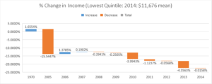
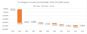
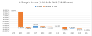
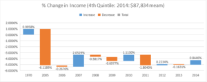
My approach is brain dead simple. I take the mean household income by quintile, add up the total and then divide each quintile by the total to get a % of the “pie” that quintile earned. Then I divide each % by the previous year’s % to get the delta from year to year. That should give a somewhat clear picture of how households in different brackets are doing comparatively over time.
I’ll put the table details below.
VISUALIZATION
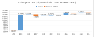
I used a waterfall chart because I think it does the best job of showing the change over time.
NOTE: The first bar is the delta from 1967-1970 and the second bar is from 1970-2005. Then it becomes annual. I’m doing this on purpose to show the long term change as well as visualizing the last recovery between 2008 and 2014 (I couldn’t find 2015 data).
INTERPRETATION
We must be honest with ourselves that without knowing the size of each group we can’t know the total impact, but I am going to assume that the highest quintile did not grow meaningfully in % of total population.
So given that assumption, since 1970 every other quintile has had a meaningful decline in income (as a percent of total income to all quintiles) with the worst drop hitting the 2nd quintile.
Additionally, since the great recession only the top quintile has had a gain in income so that pretty much explain why the perception of most people is there hasn’t been a recovery. If your paycheck goes down or stays the same… you don’t feel like anything is recovering.
Now WHY this is happening is playing itself out in lots of political and social debates. I’ll save that for a different day.
In any case it helped me understand how the country as a whole can be wealthier but the majority of the people in it can feel poorer.
RAW DATA TABLE
If you want the actual excel file, email me.

I wish more authors of this type of content would take the time you did to research and write so well. I am very impressed with your vision and insight. sub zero door adjustment